
In a study that was published at MoDELS conference in 2018 [1], I reported the results of observing the development efforts of two Software Engineering projects that used Model-based approaches to develop software for two self-driving rovers. I found that most of the effort is spent on collaboration and communication between developers. When it comes to communication, we all know that its quality in Software Engineering projects matters and has a huge impact on the development process and outcome. The quality of commination in Software Engineering is influenced by different factors: human-related (e.g., cognitive, social, and psychological factors), organization-related (flat vs. hierarchical organization), team composition and dynamics, artifacts used in the process (such as communication tools and documentation), etc.
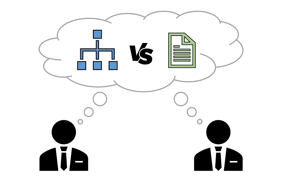
In this post, I want to share some interesting findings from studying the effect of artifacts on development communication. In particular, the impact of software design representation on software design communication. Graphical representations, such as software models, encode and present knowledge differently from textual representations. In particular, they provide a visuospatial representation of information, and can recraft this information into a multitude of forms by using fundamental graphical elements, such as dots and lines, nodes and links [2]. Also, it is known that graphical and textual knowledge representations are differently processed by the human mind.
To understand the effect of graphical vs. textual software design representations on design communication, I coordinated a family of experiments in collaboration with several researchers from four universities in Europe. The experiments are inspired by the Telephone game (or Chinese Whispers) and involved 120 pairs with a total of 240 participants (See Figure 1). In each randomly formed pair, one participant is randomly appointed as a knowledge explainer and the other one as a knowledge receiver. The participants were asked to give some information about their design knowledge and experience. The knowledge explainers were given a graphical or textual software design describing a MVC design of a software application. The explainers were given 20 minutes to read, understand, and master the design. After that, the explainers had to communicate or explain the design to the receivers in 12 minutes—- using the design artifact. The discussion between the participants was audio-recorded. Finally, the design artifacts (graphical or textual) were taken from the explainers and all the explainers and receivers were invited to answer some questions on the design artifact and the communication experience.
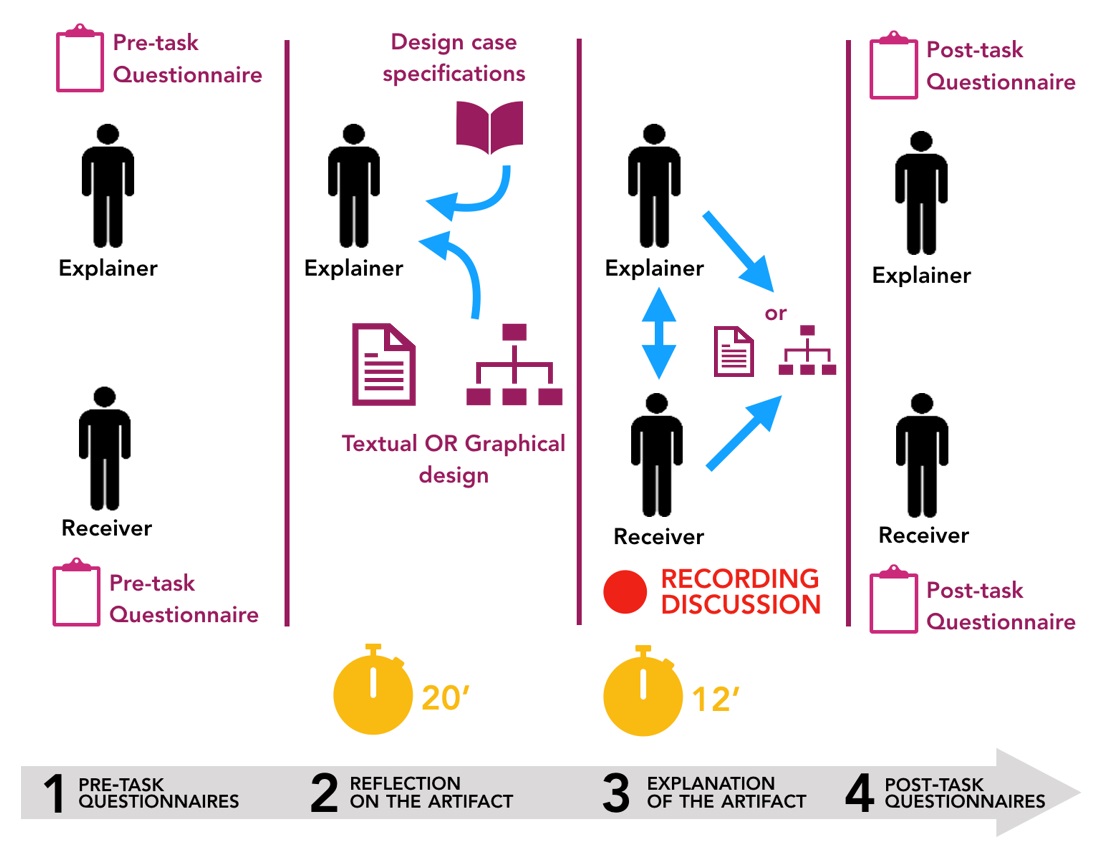
Fig 1. Software Engineering Whispers: Experimental Design
The results of this family of experiments will be soon published by the Empirical Software Engineering journal (pre-print).
I have received good news ????We are pleased to inform you that your manuscript, "Software Engineering Whispers: The Effect of Textual Vs. Graphical Software Design Descriptions on Software Design Communication", has been accepted for publication in @emsejournal
— Rodi Jolak (@RodiJolak) May 14, 2020
In the following, I summarize the main findings of this family of experiments and discuss some impacts on practitioners.
The first interesting empirical findings is that the users of graphical software design representations had more active discussions about the design than the users of the textual design representations. I mean by active discussions those in which the discussants actively question, inform, and motivate each other. Active discussions increase the quality of communication by contributing to the effectiveness of communication.
Second, we empirically found that graphical design representations support the recall of design details. In other words, the participants who used the graphical artifact during the discussion were able to remember more details about the design than those who used the textual artifact. Certainly, recalling the details of a discussion or the artifacts that were used during that discussion reduces the number of miscommunications, which in turn increases the productivity of the team and ultimately contributes to the satisfaction of stakeholders.
Third, while analyzing the recorded, and further transcribed, discussions between the explainers and receivers, we interestingly observed a difference in the explaining approach between the explainers of the graphical vs. textual artifact. Figure 2 provides an illustration of the observed explaining approaches.
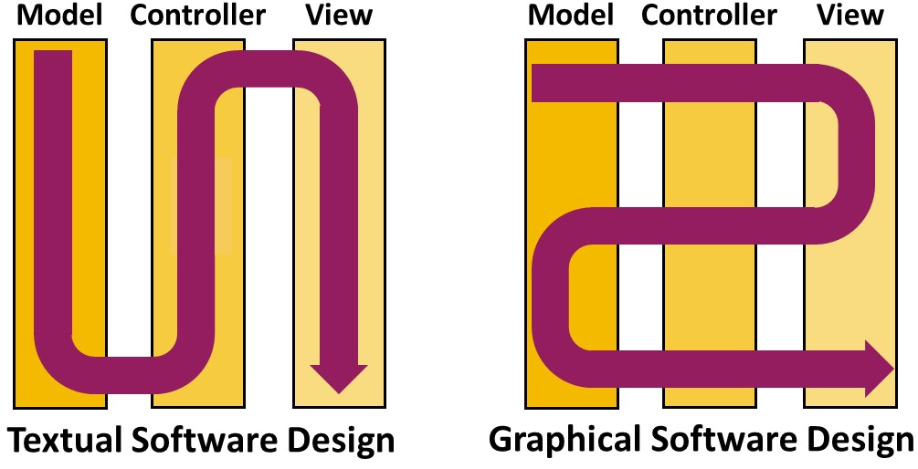
Fig 2. The Explaining Approach of Textual vs. Graphical Software Design Explainers
On the one hand, the explainers of the textual artifact tended to explain the three modules of the MVC design sequentially: Firstly the model entities, then the controllers, and lastly the views, as these modules are orderly presented in the textual document. This trend is intrinsically imposed by the nature of textual representations where the knowledge is presented sequentially on a number of consecutive ordered pages. On the other hand, the explainers of the graphical design had more freedom in explaining the design. Indeed, according to their explaining preferences, the explainers of the graphical artifact tended to jump back and forth between the three MVC modules when explaining the design. Based on this, it seems that a graphical software design representation has an advantage over the textual representation in unleashing explainers’ expressiveness when explaining the design, as well as in helping navigation and getting a better overview of the design.
Based on the previous findings, I provide the following impacts on practitioners:
- Agile development practices include several processes in which communication is at least involved, if not central. Daily meetings are, by definition, the perfect example of agile ceremony which completely relies on communication. Holding daily meetings as a mechanism for design problem solving has positive effects on the communication of the design issues. Accordingly, introducing graphical software design in daily discussions about design decisions would enhance the communication quality between participants, which in turn could strengthen the impact of applying agile practices in software engineering projects.
- Communication is one of the most time-consuming tasks in software development, requiring more effort than any other development activity. The use of graphical software design as a support for design-related communication could be of benefit for productivity. Moreover, minimizing the required effort for communication would provide developers with more time at disposal as well as reduce developers mental load, so they can focus on different tasks.
- By observing the explaining approaches of the explainers of graphical vs. textual software design representants, it seems that the graphical design representing has an advantage over the textual representation in helping navigation and getting a better overview of the design. Even though this requires more investigation, I suggest that, due to its nature, a graphical design provides more adaptability and extra degrees of explaining freedom, which makes it a better pedagogical medium for face-to-face design knowledge transfer.
Now that you have read this post, you can safely state that a picture is indeed worth a thousand words!.
References
[1] Jolak, R., Ho-Quang, T., Chaudron, M.R.V., & Schiffelers, R.R. “Model-based software engineering: A multiple-case study on challenges and development efforts”. In Proceedings of the 21th ACM/IEEE International Conference on Model Driven Engineering Languages and Systems, pp. 213-223), 2018.
[2] Tversky, B. “Multiple models. In the mind and in the world”. Historical Social Re-search/Historische Sozialforschung. Supplement (31), 59–65, 2018.

I could have just looked at the images instead of reading the whole article 😉
Good one!. As long as you access the page I’m fine either way 🙂
Thank you for sharing this – and doing empirical studies as these are really needed.
Another study comparing textual and graphical language also address the scaling: “the larger textual models require increased cognitive efforts on the user side.” It studied a bit different measures (the quality of outcome, its completeness, and the time needed) and found that with graphical languages the quality is better and completing the work also takes less time. Full study available at: https://hal.archives-ouvertes.fr/hal-01345658/document.
Thank you for referring to this interesting study which consolidates the findings that I summarize in this post and provides further benefits of using graphical or diagrammatic representations.
Hi Juha-Pekka,
many thanks for the link. I had it, but lost it somehow.
/Carsten
Yes, with a textual approach you think in chapters whereas in a model you think in relations.
A text has a strictly sequential primary structure with a secondary graph implemented by untyped references. With all graphical modeling approaches I am aware of you have a tree as primary structure and a graph of typed references as secondary structure.
Doesn’t look that different at the first glance. But references feel rather unnatural to people thinking in chapters. One the other side for people thinking in relations a reference is the the most natural thing in the world. A relation references an arbitary number of elements. So thinking in relations means thinking in references.
And that makes a huge difference. In models the number of relations tends to be number of elements to the power of approx. 1.1. This matches exactly with the COCOMO II prediction. This is no coincidence, but system inherent. With text the number of references is more or less proportianal to the number of words.
Given that models tend to describe the system much better than texts.
I think in relations, but most of my customers want to get printed paper to be signed manually. That turns out to be no problen at all as it is embarssingly easy to generate text out of models. The other way round is much more tricky.
Happy modeling 😉
Carsten
Indeed. Different representations influence the inferences about the relations between elements of the described knowledge. I suggest that you to have a look at the paper of B. Tversky which is referenced in the article (reference number 2).
Hi Rodi,
based on my 20+ years experience as facilitator/mentor in system architecture I state the root cause is the way people think. The representation merely follows the way of thinking.
So far I am aware of the
* text
* (cross-)table
* model
fraction. As mentioned before I am model native and can read text. But the table representation is weird to me. I have to transform the table content into a model to understand.
/Carsten
Thank you for our comment Carsten. I agree with you that people think differently. This is a true. But, the causes of this cognitive bias are different e.g., different background, knowledge, experience, expertise, …, used tools, or used knowledge representations or descriptions.
I think we both agree that graphical and textual representations encode knowledge differently and are differently processd by the human mind (please check the following):
Bobek, E., Tversky, B.: Creating visual explanations improves learning. Cognitive Re-search: Principles and Implications1(1), 27 (2016)
Moody, D.L.: The” physics” of notations: a scientific approach to designing visual notations in software engineering. In: 2010 ACM/IEEE 32nd International Conference on Software Engineering, vol. 2, pp. 485–486. IEEE (2010)
As a small addition, one of the IMHO best contributions ever
https://en.wikipedia.org/wiki/As_We_May_Think
which inspired
https://en.wikipedia.org/wiki/Project_Xanadu
which was re-invented as
https://en.wikipedia.org/wiki/World_Wide_Web
But the root was “As we may think”.
/Carsten
Thank you for sharing this addition 🙂
Thanks Jordi, I’m looking forward to read your preprint. While I agree in the advantages of models vs textual specifications, there’s also questions regarding the understandability of the models as communication artifacts. We recently got a paper accepted at BPM this year with were more than 90 dimensions affecting understandability of business process models were identified. My question is: in your experience, did the visual aids improve the communication for every type of information, or there are cases where a textual representation was more accurate?
Hi Hugo,
> in your experience, did the visual aids improve the communication for every type of information, or there are cases where a textual representation was more accurate?
At this level of generality I really have to state clearly NO.
People being blind from birth tend to have excellent text perception skill, but have difficulties to understand diagrams. Braille displays can “visualize” simple diagrams in a form blind people can recognize.
Even some people able to see get confused by graphical representations. I got aware of it a few years ago setting up a new PC for a school teacher in my neighborhood. The school’s CISO (chief information security officer) told the teachers to use Linux based distributions when working with personal data. So I set up her laptop with plain vanilla Ubuntu and the Gnome3 desktop. I introduced her to the desktop and then she told me: “It is the same problem as with Microsoft Windows I can see the icons — I am not blind — but the icons don’t tell me anything. Is their any way to start application via keyboard commands?”. So I showed her how to do it that way. After a week she came to me and told me: “With the keyboard commands I am at least two times more productive.”.
So it always depends on the people you deal with.
/Carsten
Hi Hugo, the communication aspects that we measured in the paper are four: Explaining, Understanding, Recall, and Inter-Personal Collaborative Communications (that include active discussion, creative conflicts, and conversation management). Considering all the four communication aspects (understanding included) there is a tendency in favor of using the graphical representations, in other words the graphical representation has a positive effect and is the improving condition. Yet, the effect size is statistically significant for active discussion, conversation management, and recall-ability.
Or to answer with another view. Text is strictly sequential or 1-dimensional. Graphics are 2-dimensional (or 3-dimensional https://www.ariscommunity.com/users/pica/2016-11-22-my-ideas-contest-rules-aris-10-years). Given that graphical representations tend to be more dense. More information is presented on the same area. This can also be contrary productive as some people try to explain how the whole world works within a single diagram. The most “impressive” diagram I have seen so far required two times DIN A0 to be printed at 6pt character size.
With text the author has to think about the order to present the topic. A given order can be very helpful to understand.
/Carsten