
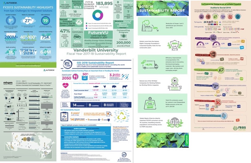
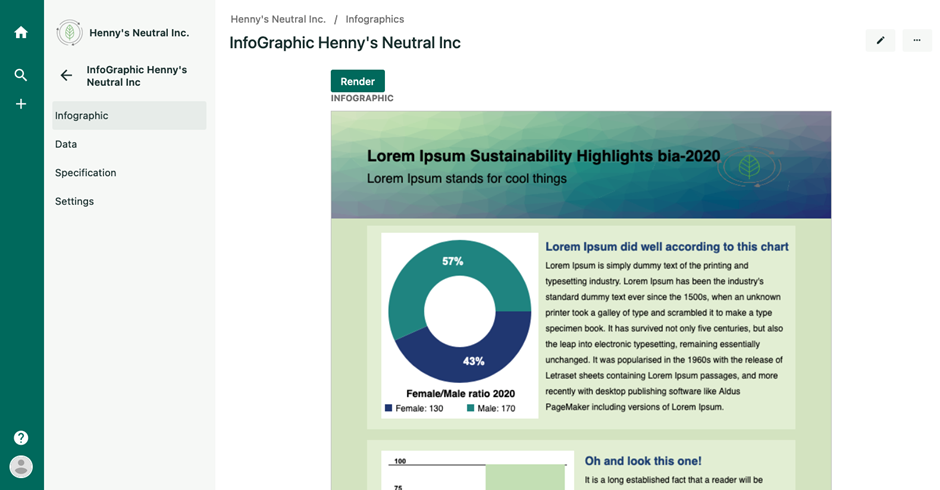
Organizations are increasingly resorting to infographics to report on their data. You may have come across infographics reporting on corporate sustainability performance, for instance. This type of infographics, which we refer to as data-centric infographics, has the following characteristics:
- While they often have an overarching discourse, their key aspect is the data they communicate. For instance, the key sustainability performance indicators. We provide some examples in the image below.
- The design is often reused over the years. For instance, many organizations recurringly report their sustainability performance using the same (or a very similar) design.
- Sometimes the design is reused for several organizations. For instance, this is the case of members of networks of social enterprises who apply the same sustainability assessment method; the network sometimes generates a similar infographic for each member, where only the data changes (e.g. see an example from the Spanish Network of Networks of Alternative and Solidarity Economy here)
In our research, presented recently in the RCIS 2022 conference, we have focused on the domain of impact measurement and, in particular, on data-centric infographics that report on ethical, social and environmental accountings (also known as sustainability, non-financial or integrated reporting). Mostly because we are engineering openESEA, an open-source tool for these purposes, and because our activism keeps us in close contact and collaboration with networks of social enterprises such as the Catalan Network of Solidarity Economy, the Economy for the Common Good, or B Corporations.
Our goal in this project was to engineer:
- a domain specific language (DSL) to model data-centric infographics, as well as
- a tool that can interpret the models and generate the required infographics, retrieving the data from its database when needed.
Requirements for a data-centric infographics tools
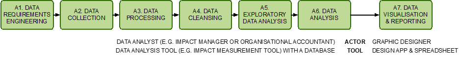
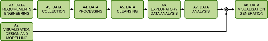
To investigate the domain better, we conducted some interviews with stakeholders that are suffering problems with creating data-centric infographics. We discovered that the current process (see image below) frequently requires rework and produces many delays.
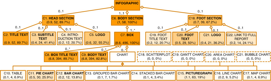
Also, to properly understand the needs to be fulfilled by the DSL and interpreter tool, we have analyzed 58 data-centric infographics used for sustainability reporting and 10 infographic creation tools. Based on these analyses, we were able to define a tree of infographic component types (see image below), and a tree of tool features. Some component types appeared in all the infographics we analyzed (e.g. boxes), whereas others were much less common (e.g. picturegraphs appeared in only 19% of the infographics). We completed the requirements specification with 36 user stories.
DSL to model infographics
Based on these requirements, we proceeded to create a DSL that could facilitate the creation (and generation) of this type of infographics.
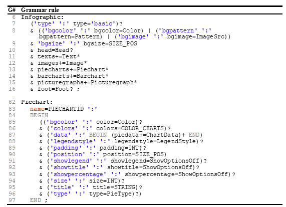
We have chosen to implement the DSL as an external DSL using the Eclipse Xtext DSL development framework. The rationale is that it lowers the efforts of producing a proof of concept and openESEA can easily parse text-based models. See an excerpt of the grammar in the image below, and the complete grammar in the companion technical report.
We also implemented the necessary features in openESEA. As a result, we can now create infographic models that are interpreted in runtime. See a toy example in the image below.
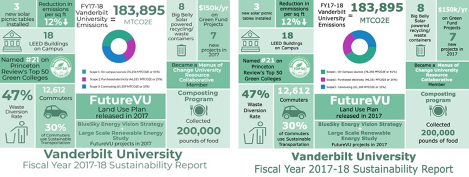
To test the approach, we selected a sample of original infographics (out of the collection we had analyzed earlier), created their corresponding models, and used our tool to produce generated infographics. The differences between both were minor in all cases. Can you figure out which one of the two infographics below is the original one and which one the generated one?
Well, we decided to conduct an experiment to assess the extent to which original infographics are indistinguishable from the corresponding generated ones. Null hypotheses are:
- H10: The visual attractiveness of original infographics is similar to the visual attractiveness score of the generated infographics.
- H20: The participants are unable to distinguish whether an infographic is original or generated.
You can read the details in the paper. The generated infographics were perceived as more attractive than original ones; although all we care is that they are not less attractive as the original ones, so we do not let this result get to our head. The participants were capable of distinguishing the type of infographics beyond pure guessing (but not very often). These are encouraging results for us. We are aware of many limitations of our work; for instance, we still do not support all infographic component types, and a graphical model would be more convenient for graphic designers. But we are confident that these limitations can be overcome in the future.
A model-driven process for the production of infographics
To sum up, we advocate for a model-driven approach for data-centric infographic production (see image below). When we showcased our tool to 3 experts in the area, they were all very positive and showed interest in adopting this approach. We are in collaborations with some of them.
With our future work, we plan to contribute to the field of model-driven engineering and, at the same time, offer a suite of open-source tools for organizations that care about their impact in society and the environment. If you are interested in collaborations, please do not hesitate to contact us.

Assistant professor in Utrecht University, teaching in the Information Science bachelor and the Master in Business Informatics. PhD in Computer Science from Universitat Politècnica de València. Author of over 80 scientific publications on requirements engineering, conceptual modelling and software for sustainability. His research line on Software for Organisational Responsibility focuses on the software-supported continuous improvement cycle of organisations that aim at increasing their performance in ethical, social and environmental topics. Member of the Spanish Network of Alternative and Solidarity Economy (REAS), of the Economy for the Common Good (ECG, Utrecht local charter), and occasional collaborator of other networks of responsible enterprises. Member of the of the Advisory Committee on Social Balance of the Catalan Network of Solidarity Economy (XES). Member of the Supervisory Board of the foundation Refugee Wellbeing and Integration Initiative.
Reach me via email but know that I reduce my stress by checking email less frequently (link)


This is one area I’ve seen others creating DSLs too. Since infographics are visual another approach would be to use modeling languages that are visual too. This makes representation in the DSL, reuse and DSL evolution also easier than in textual languages. One such approach with similar objectives is https://ieeexplore.ieee.org/document/8506502.